A mobile device has a multitude of sensors ranging from GPS to a barometer. One sensor that is used daily is the capacitive sensor. Capacitive sensors detect anything that is conductive and they are used for touch input in mobile phones. We rely tremendously on touch input to interact with our devices ranging from playing games to checking notifications. We also have the ability to use our finger or styluses to write notes directly on a mobile device. However, touch/stylus input on mobile devices has its own set of problems. We are unable to easily draw detailed diagrams or write notes using the touch screen.
Is there another way to provide a different method of digitizing notes with a mobile device that expands the capabilities of touch? Another sensor that can be used for alternative methods of interaction is a magnetometer. The magnetometer senses changes in the magnetic field in all three axes (x,y,z) [10]. If the magnetic field can be detected, then it is possible to alter the magnetic field by using an external magnet. When the external magnet is moved around, it will alter the magnetic field thus producing different (x,y,z) values.
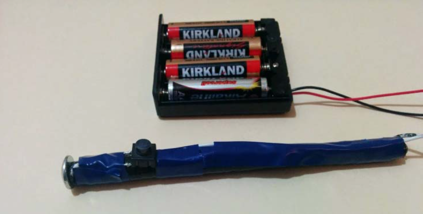
MagPen is a system that allows the user to digitize notes while they are written on a sheet of paper. The pen itself contains magnets or it can be an electromagnet. As the pen moves around in the area next to the phone, the changes in the magnetic field are detected and they are mapped out onto an x-y plane. To simulate an actual pen, the pen will only emit a magnetic field when the tip is pressed down. That allows the phone to only recognize actual pen inputs and not the pen movements.
To enable a richer set of interactions, the magnetic field strength can be used to control various pen attributes, such as stroke size or color. This is accomplished by moving the magnet based pen closer and further away to control the size of color.
There has been existing work in the industry that attempts to solve this problem. A few examples are Livescribe, Equil JOT, or the Wacom Tablets. This devices however require additional devices and/or special pen and paper to be able to digitize these notes. MagPen attempts to remove the need of additional devices by just requiring your mobile device and a custom pen.
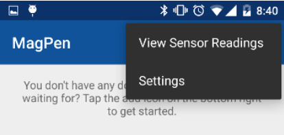
To read more about this, take a look at the project writeup here.
In this project, we attempt to understand the circumstances that make biking unsafe through our data and our visualization of it. We analyze a dataset of bike accidents across the US taken from the Fatality Analysis Reporting System (FARS). We consider time of day (which gives us an indication of lighting condition on the road), weather conditions, what part of the road the bike-rider was on (e.g. bike lane, normal road, crosswalks, etc.), and finally whether the state in which the accident occurred allows bikes to be ridden on sidewalks.
Visualization Description:
We have decided to have a three part visualization that will help us understand bicycle fatality trends:
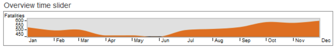
The first view is an overview that shows the US average across the calendar year. This will help the user to quickly identify periods of the year where there are significantly more or less bicycle fatalities. The view also allows the users to click and drag to select a portion of the year to focus on. The selected period of the year will update the remaining visualizations to fatalities occurring during that calendar period.
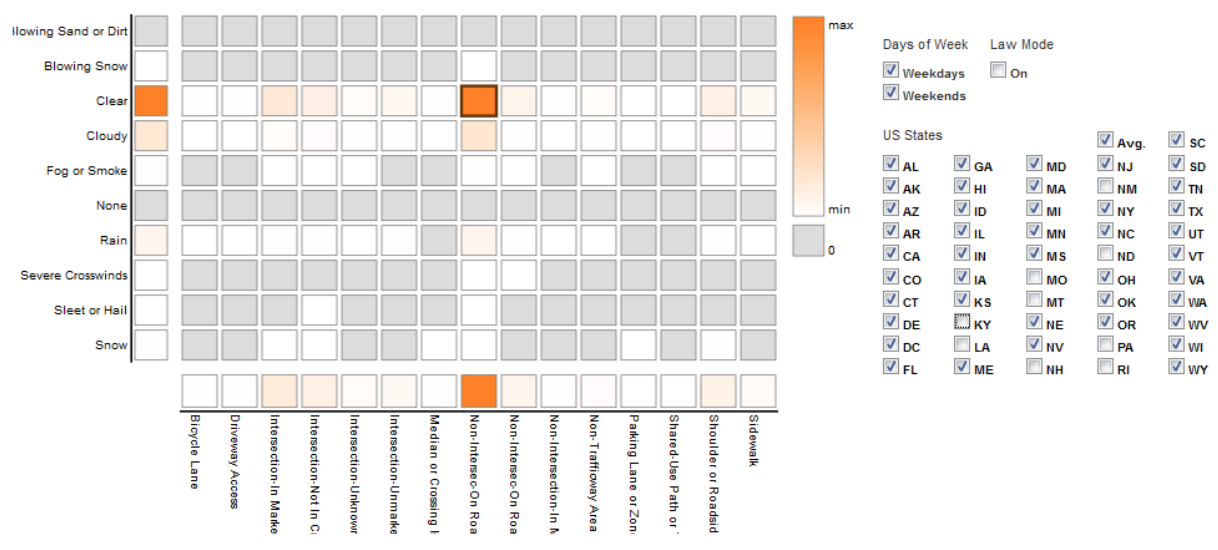
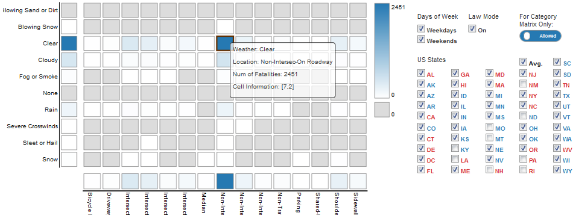
The second view is a category matrix heatmap with the y axis having weather conditions and the x axis having relative street riding locations. This view represents the number of fatalities in a heat map style with color coding. However, it is important to note that the data displayed is restricted to the states selected from the states control filter on the right. Hovering over any cell in the category data matrix would give the details of the cell to the user. The details would include the weather, location that the cell represents, and the number of fatalities for that combination of weather and location.
There is also a law mode feature to allow the coloring on the graph to be in red for sidewalk riding prohibited and blue for permitted. Once the user has selected the states, the user can select a rectangle from the matrix heatmap, and this will be broken down into individual state lines for the multi-line graph. Additionally, a user may select a rectangle from either axis of the category data matrix and this will show the average for the selected axis category across all the categories of the other axis in the multi-line graph.
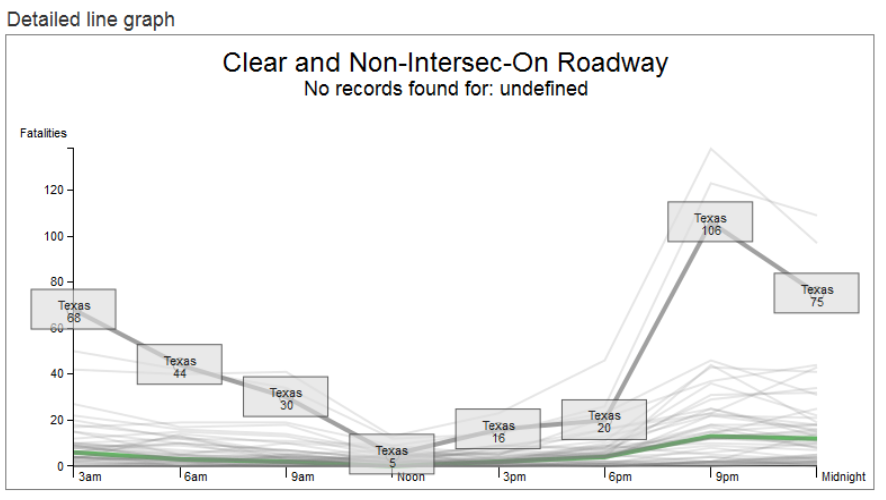
The third view is a multi-line graph that will show the details of each selected state as an average, for the specified category of weather and riding location, during the specified calendar period. Each data point for a line represents the average number of bicycle fatalities for three hour time blocks across the whole day. When the user hovers over a line, it will highlight and show the state it represents as well as the exact value of each data point. Additionally, the US average value will always be shown for an easy comparison with a hovered over state line. Also, if law mode is selected each line will be drawn red or blue based on the state law. This will help to easily see a trend among the selected states how it compares to the average.
Basic Interactions:
The overview time slider as well as the checkbox control panel (to select states, weekdays / weekends) will affect the numbers displayed on both the category data matrix and the line graph.
Additionally, clicking on any cell in the category matrix heatmap would pull up the line graph view for that combination of weather and location which the category data matrix represents (e.g., ‘Clear’ Weather and ‘Sidewalk’ Location), and all other filters such as time, week days and state selections would also apply. The user can click on multiple cells in the matrix and one line chart for each cell shows up in the space below. Deselecting the cell in the matrix removes the corresponding line graph.
Many Android developers have been itching to get their hands on Android 5.0 compatibility libraries to integrate it into their applications. I am working on integrating it into Spottr (a data usage monitoring application). In this post I will discuss my process of integrating Material Design and the items that the app compatiblity libraries have to offer.
Integrating Compatibility Libraries
AppCompat v21, a library that backports Android 5.0 libraries to previous verisons of Android has been released. A mini sidebar on compatiblity libraries. There are multiple android support libraries that backport a different feature sets in Android. The v4 Support Library backports the largest set of APIs (related with Fragments, Pagers, Accessibility, and much more). The v7 compatibility libraries support ActionBar APIs back to Android API Level 7 (Android 2.1). You can check out the rest of the support libraries here.
To begin integrating the support libraries, you must add them to your build.gradle file.
The project will need to compiled against Android 5.0 Libraries (API Level 21) to take advantage of the latest APIs. In your build.gradle file, you will need to set the compileSdkVersion to 21 and the buildToolsVersion to ‘21.0.1’. Note this does not limit your app only be compatible with v21, it just compiles against v21. The minSdkVersion specifies the lowest API that your app is compatible with.
Working with Compatibility Libraries
App Theme
To start off, we need to update the theme of the application. This would be in your themes.xml or styles.xml. Your app theme’s parent should be based off of Theme.AppCompat. In the example below I have chosen to use Theme.AppCompat.Light as my parent theme. Make sure to remove all other instances of AppTheme in your styles.xml and themes.xml files.
App Theme in themes.xml
<?xml version="1.0" encoding="utf-8"?><resources><stylename="AppTheme"parent="Theme.AppCompat.Light"><!-- Set AppCompat’s actionBarStyle --><itemname="actionBarStyle">@style/BlueActionBar</item><!-- Set AppCompat’s color theming attrs --><itemname="colorPrimary">@color/primary_color_blue</item><itemname="colorPrimaryDark">@color/primary_darker_color_blue</item></style></resources>
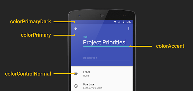
In your main application theme, you will need to set the colorPrimary and the colorPrimaryDark. You can set these in your colors.xml file.
Next, make sure your activities extend ActionBarActivity instead of Activity.
publicclassMyActivityextendsActionBarActivity
Toolbar
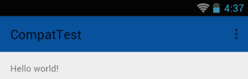
Right now if you run your application, your actionbar will be styled with the primary color. If you are testing this on Android Lollipop, your status bar will also be colored. However, this is not using the new Toolbar APIs in the 5.0 and Compatibility Libraries. It is using the old ActionBar APIs. The reason to use the Toolbar apis are to have the ToolBar directly in your layouts. This will allow developers to interact with the ToolBar as any other view, allowing animations and etc. It is also possible to set the height of the ToolBar to various sizes to follow the new Material Design Guidelines.
To implement Toolbar, some changes will need to be made within your layouts and in your activities. The layout for the default activity would look like this:
It contains the FrameLayout to allow the use of Fragments in the activity. Adding a Toolbar is not complicated. Since the toolbar is now part of our view, we will have the toolbar at the top of the screen withour view elements below it. To achieve this this, a vertical LinearLayout is needed as the parent element, and the ToolBar and FrameLayout inside the linear layout:
One additional change to be made is letting your activity know that you will be using the toolbar instead of the application bar. In your onCreate method, set your actionbar to your Toolbar in your layout:
Now, when you run the application, you might get an error (displayed below). If you get these errors, be sure to set windowActionBar to false in your AppTheme. This will tell your application, you will no longer be using ActionBar and will be using your own toolbar. If your application will have a mix of ActionBars and Toolbars (which I would not reccommend), you can use different themes with different settings of windowActionBar to achieve this type of functionality.
windowActionBar error
java.lang.RuntimeException: Unable to start activity ComponentInfo{com.squarestaq.compattest/com.squarestaq.compattest.MyActivity}: java.lang.IllegalStateException: This Activity already has an action bar supplied by the window decor. Do not request Window.FEATURE_ACTION_BAR and set windowActionBar to false in your theme to use a Toolbar instead.

Caused by: java.lang.IllegalStateException: This Activity already has an action bar supplied by the window decor. Do not request Window.FEATURE_ACTION_BAR and set windowActionBar to false in your theme to use a Toolbar instead.
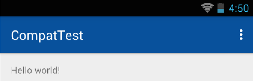
You will notice a slight change in your Toolbar, the font should be somewhat differet as well as the “flatness” of the Toolbar. Now you may be asking your self, where is my shadow?! A shadow will not exist under a toolbar for pre-lollipop devices due to the elevation attribute not being supported. The elevation attribute will only work on lollipop devices.
To add a shadow to your toolbar, you will need to add it manually by using a 9 patch drawable. The Google I/0 app does exactly this to achieve a shadow under the toolbar link. Download the shadow 9-patch drawable here and add it to your FrameLayout in your activity as the windowForegorund attribute.
We also need to set the theme of our toolbar so our text is the right color. This is most noticable when the primary color is dark and the toolbar text colors need to be changed to white. To do this, we need to create a separate theme for our Toolbar:
Our Toolbar Overflow Menu is currently white text on a black background. If we needed to change this, we need to specify a new popup theme for the toolbar. Create a BaseToolbarPopupStyle in your styles.xml. By setting the background, and textColorPrimary attributes we can control the toolbar’s overlflow menu’s background color and text color.
It is also possible set the accent colors of widgets. (tinting the widgets). To do this set the colorAccent attribute in your Toolbar’s theme.
<item name=”colorAccent”>@color/accent</item>
On earlier versions of Android AppCompat will only tint a subset of UI Widgets:
Everything provided by AppCompat’s toolbar (action modes, etc)
EditText
Spinner
CheckBox
RadioButton
Switch (use the new android.support.v7.widget.SwitchCompat)
CheckedTextView
Misc
There are also other ways of using the Toolbar, such as on the bottom or part of the screen. See this link to find out more information.
AppCompat also provides material design theme widgets. I was unable to find a complete list of widgets that applied the material design theme, however it seemsl ike any widgets that support tinting also implement the material design themes.
EditText
Spinner
CheckBox
RadioButton
Switch (use the new android.support.v7.widget.SwitchCompat)
CheckedTextView
Troubleshooting
Duplicate Resources Error
If you run into this issue (detailed below) them make sure the AppTheme does not exist anywhere else in your other resource files.