BicycleVis - Investigating Bicycle Fatality Patterns
28 Dec 2014Problem Description:
In this project, we attempt to understand the circumstances that make biking unsafe through our data and our visualization of it. We analyze a dataset of bike accidents across the US taken from the Fatality Analysis Reporting System (FARS). We consider time of day (which gives us an indication of lighting condition on the road), weather conditions, what part of the road the bike-rider was on (e.g. bike lane, normal road, crosswalks, etc.), and finally whether the state in which the accident occurred allows bikes to be ridden on sidewalks.
Visualization Description:
We have decided to have a three part visualization that will help us understand bicycle fatality trends:

The first view is an overview that shows the US average across the calendar year. This will help the user to quickly identify periods of the year where there are significantly more or less bicycle fatalities. The view also allows the users to click and drag to select a portion of the year to focus on. The selected period of the year will update the remaining visualizations to fatalities occurring during that calendar period.

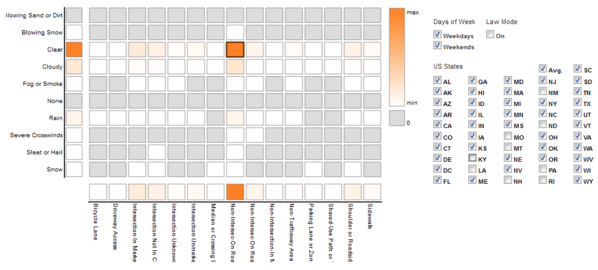
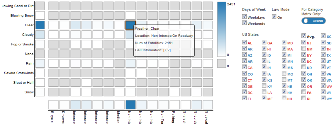
The second view is a category matrix heatmap with the y axis having weather conditions and the x axis having relative street riding locations. This view represents the number of fatalities in a heat map style with color coding. However, it is important to note that the data displayed is restricted to the states selected from the states control filter on the right. Hovering over any cell in the category data matrix would give the details of the cell to the user. The details would include the weather, location that the cell represents, and the number of fatalities for that combination of weather and location.

There is also a law mode feature to allow the coloring on the graph to be in red for sidewalk riding prohibited and blue for permitted. Once the user has selected the states, the user can select a rectangle from the matrix heatmap, and this will be broken down into individual state lines for the multi-line graph. Additionally, a user may select a rectangle from either axis of the category data matrix and this will show the average for the selected axis category across all the categories of the other axis in the multi-line graph.

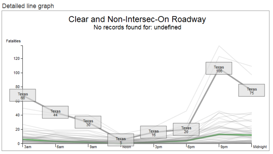
The third view is a multi-line graph that will show the details of each selected state as an average, for the specified category of weather and riding location, during the specified calendar period. Each data point for a line represents the average number of bicycle fatalities for three hour time blocks across the whole day. When the user hovers over a line, it will highlight and show the state it represents as well as the exact value of each data point. Additionally, the US average value will always be shown for an easy comparison with a hovered over state line. Also, if law mode is selected each line will be drawn red or blue based on the state law. This will help to easily see a trend among the selected states how it compares to the average.
Basic Interactions:
-
The overview time slider as well as the checkbox control panel (to select states, weekdays / weekends) will affect the numbers displayed on both the category data matrix and the line graph.
-
Additionally, clicking on any cell in the category matrix heatmap would pull up the line graph view for that combination of weather and location which the category data matrix represents (e.g., ‘Clear’ Weather and ‘Sidewalk’ Location), and all other filters such as time, week days and state selections would also apply. The user can click on multiple cells in the matrix and one line chart for each cell shows up in the space below. Deselecting the cell in the matrix removes the corresponding line graph.
To find more about this, take a look at the project video and the design document.